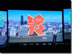
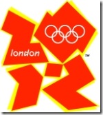
So the new brand identity for the London 2012 Olympic Games and Paralympic Games has been unveiled in London this morning.
The logo comprises shapes representing the number 2012, the Olympics rings and the word “London”.
It looks like the organisers have gone for a logo that appeals to the young audience that the games seek to inspire. It’s certainly a bold visual statement compared to previous games logos.
This bold choice is likely to polarise opinion in the short term, but the challenge for the designers on a project like this is to come up with something that will last through to 2012 and beyond, while satisfying the complicated network of stakeholders that comes with large-scale sporting events. There won’t be an opportunity to rebrand, which is a luxury most brands will have in the next five years.
Often logos for large events and organisations are bland – by seeking to appeal to many different target audiences they are watered down to a point where they don’t really stand for much to anyone.
It’s nice to see that the London 2012 organisers have clearly targetted a young demographic with this identity and avoided trying to be all things to all men.
In my experience the initial reaction to logos bears little resemblance to the long-term impact of the overall brand – in the longer term it’s about how the identity shows up as part of the overall brand, and the applications where it’s used.
After brands are as much about what you do as how things look.
The London 2012 brand stands for passion, achievement, inspiration and participation. It’ll be the actions of the games organisers that make these brand values come alive, not the logo.
Over time the logo will become the common identity that binds the diverse range of cultural, sporting and educational activities together.
What do you think about the new logo? Is it a bold move to target young people, or have the organisers missed the mark?
More launch images available on Flickr. Initial coverage from BBC News.
Update: further analysis here.
[tags]london+2012, london, logo, olympics, brand, branding, paralympics, london+2012+logo[/tags]


